How small improvements can boost clarity, trust and engagement
Improving charity websites doesn’t require a full rebuild to boost clarity, trust, and engagement.
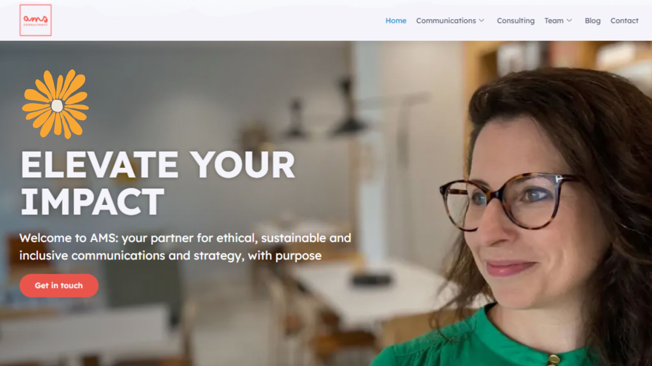
Your website is the digital front door to your organisation. It’s where new visitors form first impressions, where potential donors decide whether to give, and where partners learn what you stand for.
But many charity websites don’t live up to their potential. Pages can feel cluttered, messages get buried, and visitors struggle to know what to do next. The good news? You don’t need a full rebuild to make a meaningful difference.
Here are five practical, low-cost improvements drawn from AMS’s communications audits and work with purpose-driven organisations.
1. Make Navigation Effortless
If your visitors have to stop and think about where to click, you’ve already lost them. Keep your main menu short, ideally five or six items, and group pages under clear, familiar headings. “What we do,” “Get involved,” and “Donate” work better than internal terms like “Programmes” or “Support pathways”.
Think about your audience’s journey. A donor might want to see impact stories first; a teacher or volunteer might head straight to resources. Design your navigation around their priorities, not your internal structure.
Simple menus and intuitive links reduce friction and encourage visitors to stay longer.
2. Put Your Story Front and Centre
When someone lands on your homepage, they should immediately know three things: who you are, what you do, and why it matters.
This message should appear right at the top of your site in a short, human sentence that captures your mission. For example:
“We help displaced children in the Middle East learn, grow, and thrive through digital education.”
Avoid jargon and lead with impact, not process. A strong photo or short video that shows people, not logos, will instantly build a connection.
Your homepage is not a storage cupboard, it’s a doorway that invites people to explore. Avoid listing everything on it and let the rest unfold as visitors move through your site.
3. Use SEO That Serves People First
Search engine optimisation (SEO) can feel technical, but at its core it’s about writing clearly about what you do.
Include phrases your supporters actually search for such as helping refugees access education or charity website tips, in your headings, introductions, and image descriptions. Keep your page titles descriptive and avoid generic links like “click here”.
SEO is as much about structure and accessibility as keywords. If your content reads smoothly, uses clear subheadings, and follows a logical flow, search engines will reward it.
Good SEO isn’t about chasing algorithms. It’s about helping the right people find you when they need you most.
4. Add Clear Calls to Action Everywhere
Every page should make it easy for someone to take the next step.That may be donating, subscribing to a newsletter, downloading a resource, or reading another story. Without a clear call to action (CTA), even interested visitors will drift away.
Keep your CTAs simple and consistent: “Donate now”, “Join our newsletter”, or “Learn how you can help”. Use buttons that stand out but still align with your brand style, and place them at natural points in the page, not just at the bottom.
A good rule of thumb: no page should be a dead end.
5. Prioritise Accessibility for All
Accessibility is about inclusion and it benefits everyone.Small improvements, such as increasing text contrast, choosing readable fonts, and checking colour combinations, can make your site readable for all users. Add alt text to images and ensure your forms are simple and easy to complete on both desktop and mobile.
More than half of charity website visitors now browse on their phones. If your site isn’t mobile-friendly, you’re likely losing supporters without even realising it.
Accessibility also means inclusivity, ensuring your site works for people with different needs. This can involve tools such as a built-in voice reader, or colour-adjustment and high-contrast modes for users with low vision or colour sensitivity.
Accessibility isn’t a technical box-tick. It’s part of being human-centred; making sure everyone can engage with your story, regardless of ability or device.
In Summary
A hardworking website doesn’t need to be flashy or complex. It needs to be clear, consistent, and human.
Start by simplifying your navigation, surfacing your story, writing for real people (and search engines), adding strong CTAs, and prioritising accessibility.
When your digital space reflects the heart of your mission, people feel it. And that’s when they act.
–
If you’re thinking about how these charity website improvements could work for your organization, AMS supports purpose-driven teams with clear, practical communications services. From website and messaging audits to focused recommendations, we help you identify small changes that create real impact. You can explore our services or get in touch to start a conversation.